Economics Graphs in R: Basics
I taught an intermediate macro class in pandemic semester Spring 2021. My class was primarily taught using live Zoom lectures, videos, and posted html lecture notes. The most time consuming part of the conversion from in-person lecture to hybrid format was creating graphs. I considered a few options:
- Draw them out by hand and upload scanned versions. This would have been by far the simplest/least time consuming option. It would also have been by far the ugliest.
- Use something like MS Word. This is a great option if you know how to use MS Word and you don’t care about portability. I didn’t see how it would fit into my workflow and I didn’t see how I could easily reuse those graphs.
- Use html with svg. This was the first option I considered seriously. If your goal is to post something in html, it makes sense to use html directly, and svg is obviously flexible enough to do what I need. It didn’t take long to realize that writing svg inside html is about as productive as doing econometrics with punch cards. Things as simple as specifying the coordinates of a point on the figure are awkward.
- Use Javascript. This seemed like a better version of the previous option. You can set up the boilerplate html using a Javascript function and then manipulate the boilerplate to get the figure you need. This actually worked great with the exception of two serious flaws: I had to write Javascript and I had to write out every last bit of low-level foundation myself. I didn’t want to write Javascript and I didn’t have time to write my own foundational libraries. This lasted about two or three weeks. A couple of simple graph types was enough to know this was a bad idea.
- Use Typescript. I’d never used Typescript. Everybody talks about how much of an improvement it is on Javascript. I lasted maybe an hour. Web developers have this weird obsession with configuring projects and setting up complicated dependency schemes rather than writing programs.
- Use R with RStudio. Life got a lot easier once I did this. R is an efficient machine for the production of graphs. RStudio is an efficient machine for turning R code into html.
Draw the Axes
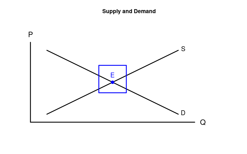
Begin by plotting a single point that won’t appear in the plot:
plot(-1, ylim=c(0, 12), xlim=c(0, 12), xlab="", ylab="", xaxt='n', yaxt='n', axes=0, main="Supply and Demand")-1: the point to plot. When passing the other configuration options, you have a blank plot, because -1 is not within the x and y ranges I’ve specified. The only other way I know how to create a blank plot is withplot.new(), but then I can’t pass the configuration options.ylim=c(0, 12), xlim=c(0, 12): The range of the x and y axes is from 0 to 12. You’ll note that these are longer than needed for the labeling we’ll do later.xlab="", ylab="": No labels on either axis.xaxt='n', yaxt='n': No x or y axis information.axes=0: No border around the outside. I only want the standard left and bottom borders on my graphs.main="Graph A": The name at the top of the graph.
Now add on the x and y axes:
segments(0, 0, 0, 10, lwd=3)
segments(0, 0, 10, 0, lwd=3)
This plots two line segments, one from (0, 0) to (0, 10), and the other from (0, 0) to (10, 0). lwd=3 gives thicker lines, which I think looks better. You now have the foundation of your graph - the axes plus a title.
Plot the Supply and Demand Curves
Let’s add the supply and demand curves:
segments(1, 1, 9, 9, lwd=3)
segments(1, 9, 9, 1, lwd=3)
The supply curve runs from (1, 1) to (9, 9) with a thickness of 3. The demand curve from (1, 9) to (9, 1).
Add Axis Labels
text(0, 11, "P", cex=1.6)
text(10.5, 0, "Q", cex=1.6)
This adds labels on the two axes. cex=1.6 enlarges the font 60%, which looks about right to me. (0, 11) and (10.5, 0) seem good to me, though you might have your own preferences.
Label the Curves
text(9.3, 9.2, "S", cex=1.4)
text(9.3, 1.2, "D", cex=1.4)
The placement and size look about right to me. Again, your preferences may be different.
Label the Equilibrium
The equilibrium will be at (5, 5). Let’s add a blue point and blue “E” to highlight the equilibrium.
points(5, 5, pch=19, cex=1.5, col="blue")
text(5, 5.9, "E", col="blue", cex=1.4)
Highlight the Equilibrium
If you want to get really fancy, you can put a thick blue square around the equilibrium to highlight it for the students:
symbols(5, 5.4, squares=1, fg="blue", lwd=3, add=TRUE)5, 5.4: The coordinates of the center of the square.squares=1: Put a square with width of 1 inch centered at (5, 5.4).fg="blue": For some reason, you usefgto specify the color when callingsymbols.lwd=3: Width of 3.add=TRUE: By default,symbolscreates a new plot. This tells it to add the symbol(s) to the existing plot instead.
Using the Plot
You can do whatever you want with the plot. Probably the easiest way to get it into an html file is to use R Markdown and compile to a standalone html file. This is especially convenient because it converts the R figures into gibberish that is embedded inside the html file. That way all you need is the single html file. No need to bother with keeping images together with the html file. Here’s what the png file looks like:
All the Code
You can view the complete code for this example as a Github gist.